Paint Color Trends for 2026: Creating a Home That Feels Like You
As we look ahead to 2026, paint color trends are shifting in a beautifully grounded direction. Homes are becoming softer, more soulful, and intentionally comforting—places that truly reflect who we are and how we want to feel. The focus is less on making a big statement and more on creating a sense of calm, connection, and ease throughout every room.
This year’s emerging palettes blend depth with approachability: warm midtones, earthy neutrals, and hues that feel collected rather than curated. Two standout colors—Benjamin Moore Silhouette AF-655 and Sherwin-Williams Universal Khaki SW 6150—perfectly capture this thoughtful, elevated style.
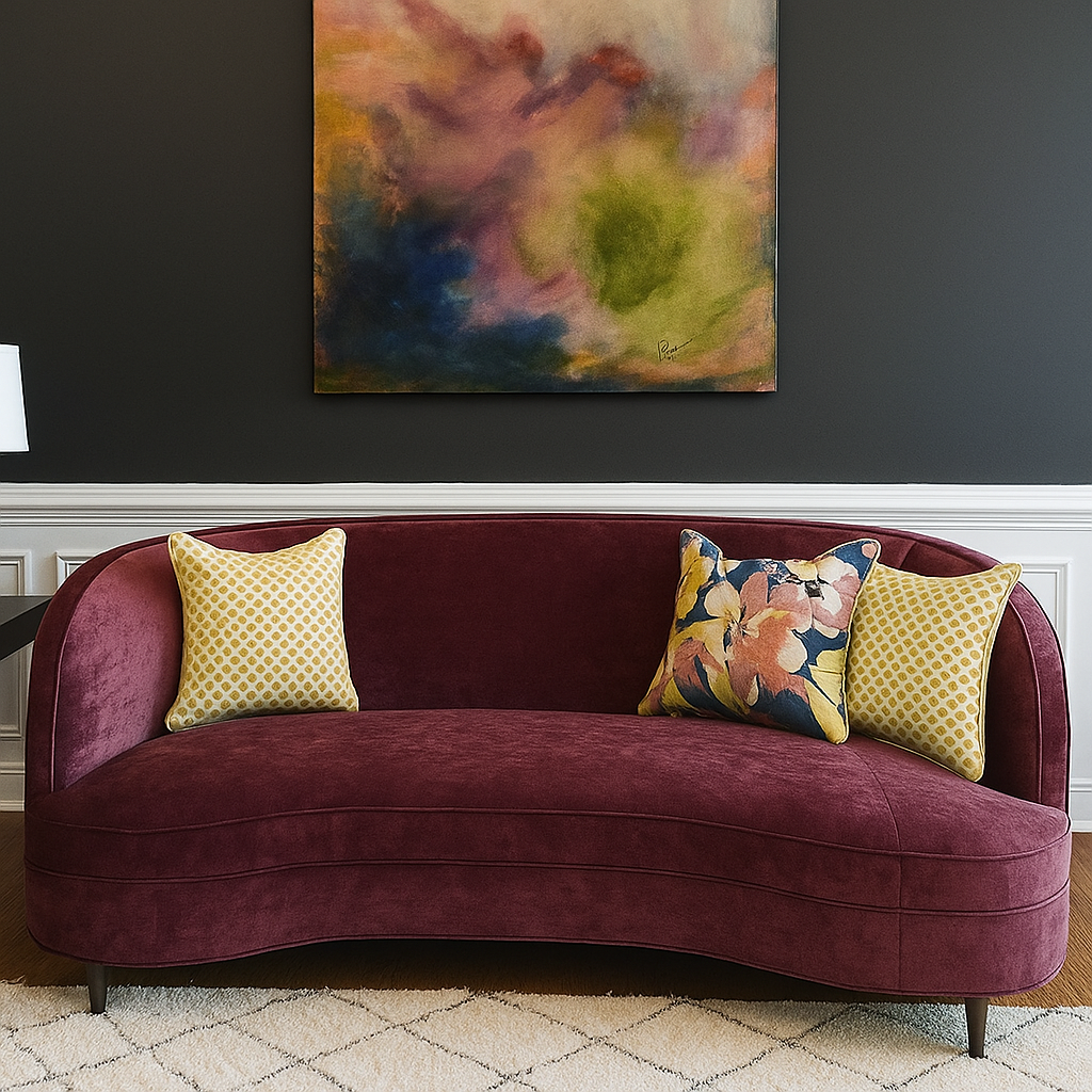
Benjamin Moore: Silhouette AF-655
Silhouette is rich, moody, and sophisticated—but in a way that still feels soft. It’s the kind of color that works beautifully in a dining room or bedroom, where warmth and intimacy are key. Its blend of earthy umber and soft charcoal means it adds depth without feeling heavy. Think: candlelight, cozy conversation, and texture layered with intention.
Refined Elegance
“A distinctive color that weaves luxurious burnt umber with delicate notes of charcoal, Silhouette AF-655 lends style and grace to the Color Trends 2026 palette of enchanting pales and handsome midtones. Balanced between deep and delicate, traditional and poetic, this inviting palette can bring chic style to any space. Indulge in hues that stand alone with incomparable presence, or pair with other colors for a sophisticated approach to layering.”
Pair Silhouette with natural wood, linen, brushed brass, or soft cream trims to emphasize its elegance. It’s a color that says quiet confidence.
Discover Your Style
“Thread craftsmanship into any design with this artfully balanced selection of ethereally lifted and deeply grounded hues. The Benjamin Moore Color Trends 2026 palette signals a return to timeless classics and thoughtful attention to detail.”
Sherwin-Williams: Universal Khaki SW 6150
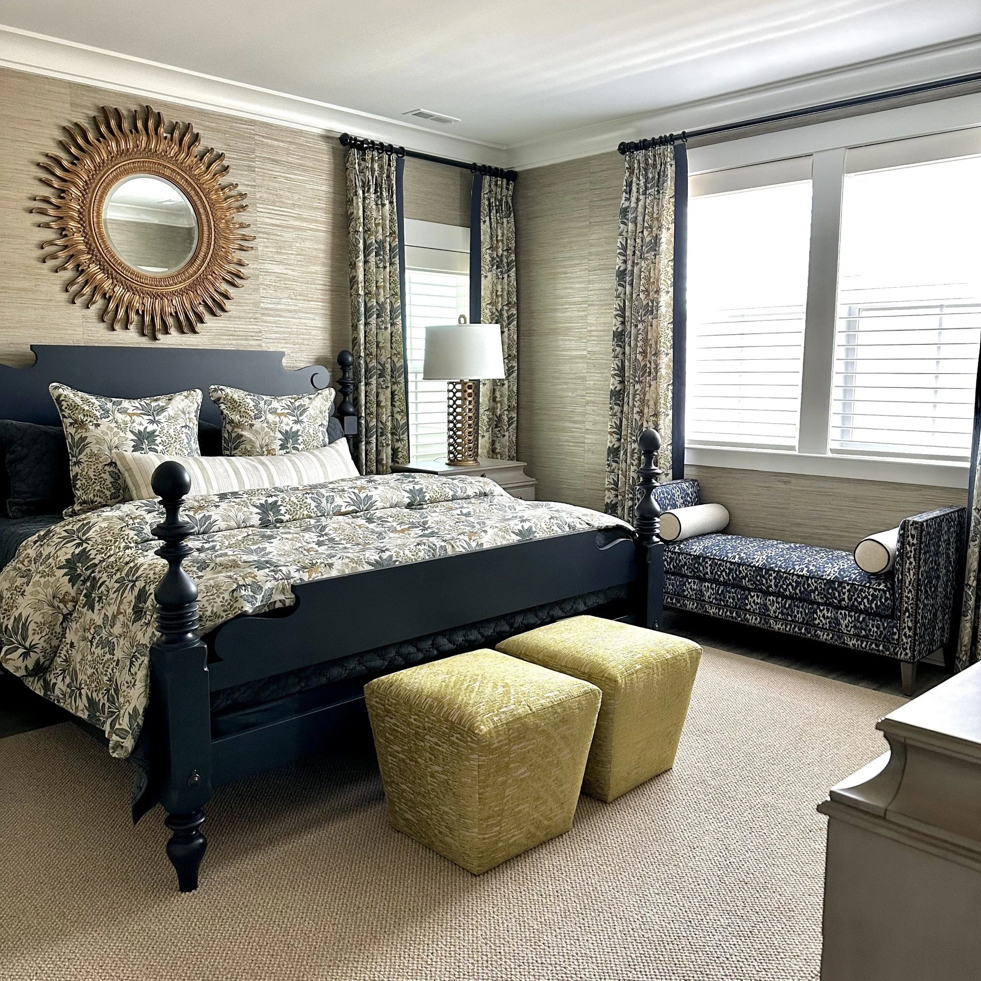
Universal Khaki is a gentle, grounded neutral that never asks for attention, but effortlessly supports the mood of a room. It has that easy “lived-in but refined” look—perfect for main living spaces, hallways, and open-concept layouts where flow matters.
This khaki tone is warm without being yellow, calming without feeling flat, and pairs beautifully with both warm woods and crisp white trim. It’s the kind of color you’ll love for years, which is always the goal.
Tailored & Timeless
“Find strength in simplicity with Universal Khaki SW 6150, an essential neutral selected by our color experts for its beautiful balance of livability and longevity.”
Image and quote from SherwinWilliams.com
Why Coordinating Your Colors Matters
One of the most important parts of designing a home that feels welcoming is color continuity. The rooms don’t have to match—but they should relate to one another. When your home has a unified palette, it feels restful and intentional. Your eye moves through the space effortlessly, and the atmosphere becomes soothing instead of visually overwhelming.
Think of your home as a story:
Start with a grounding neutral (like Universal Khaki or a similar grasscloth) for your shared living spaces.
Add depth and character in special rooms or tucked-away corners (like Tarragon or a classic Navy).
Layer in soft supporting hues through textiles, rugs, art, and decor.
This creates a home that feels cozy, lived-in, and deeply welcoming—a place that supports your everyday life.
The Heart of the Trend: Warmth, Comfort, and Connection
As life continues to move fast, home remains our soft landing place. The colors we choose shape how we feel within those walls. The trend for 2026 isn’t about what’s new—it’s about what feels good.
Warmth over cool.
Layers over minimalism.
Comfort over perfection.
If you’re thinking about refreshing your home this year, consider choosing colors that support your sense of calm and reflect the way you want to live, not just the way you want your home to look.
Your home should feel like you—warm, welcoming, inviting, and full of heart. Let’s get started!


